You have the wall in mind already — the wide stretch above the sofa, or the staircase run that climbs past nothing, blank for two or three years now. And you have the photos: thousands of them, the trip abroad, the kids at the lake, your grandmother’s old street, all loved and none of them printed. The reason they’re still on your phone isn’t laziness.
It’s that “print them” always dead-ends at “print them how,” because the honest fear underneath is that a gallery wall built from your own snapshots comes out looking like a fridge collage that migrated to the living room — mismatched, cluttered, and quietly announcing that you tried. That fear is why the wall is still empty, and it’s a reasonable one. Most gallery walls do look like that.
So let me be honest before I tell you it’s fixable. A gallery wall is genuinely harder than a single piece. When one canvas carries a wall, the picture is the whole design problem and you solve it once. A cluster is a second problem stacked on the first: not just “is each image good” but “do these images talk to each other” — spacing, alignment, and whether the set reads as one decision or six unrelated ones. Anyone who tells you to just mix and match and call it eclectic is describing exactly the wall you’re afraid of. The clutter is real. But it has a cause, and the cause has a fix.
Why an intentional gallery wall reads intentional
Walk past a gallery wall that works and something settles before you can say why. It isn’t matching subjects — the good ones almost never share a subject. It’s a common thread: some single property every piece obeys, so your eye reads the group as one object instead of a pile.
Most people reach for the wrong thread. They try to match what’s in the pictures — all beach photos, all black-and-white, all the kids — and it still looks busy, because raw photographs carry too much: different light, different cameras, different years, thousands of competing tonal details in each frame. Worse, your best photos are rarely all of one thing, so matching subjects means hanging weaker images or giving up.
The thread that actually holds is a single consistent art style, plus a consistent format and spacing. Render completely different photos in the same calm style and they stop being separate photos and become a set — same brushwork, same paper, same reduction of detail running through all of them like a through-line. Think of a museum room hung with one painter’s work: wildly varied in subject, instantly coherent, because one hand made everything. That shared hand is what a guest reads as “curated,” and it’s the one variable you can fully control from your couch.
This is the part that’s easy to show and hard to believe until you see it. Three unrelated photos — a hillside street, a misty valley, a sunlit alley — all put through one watercolor wash:
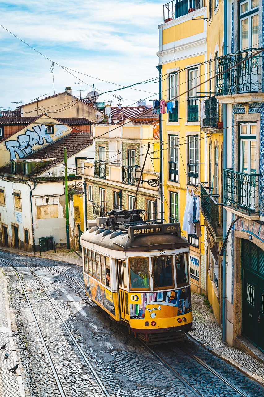
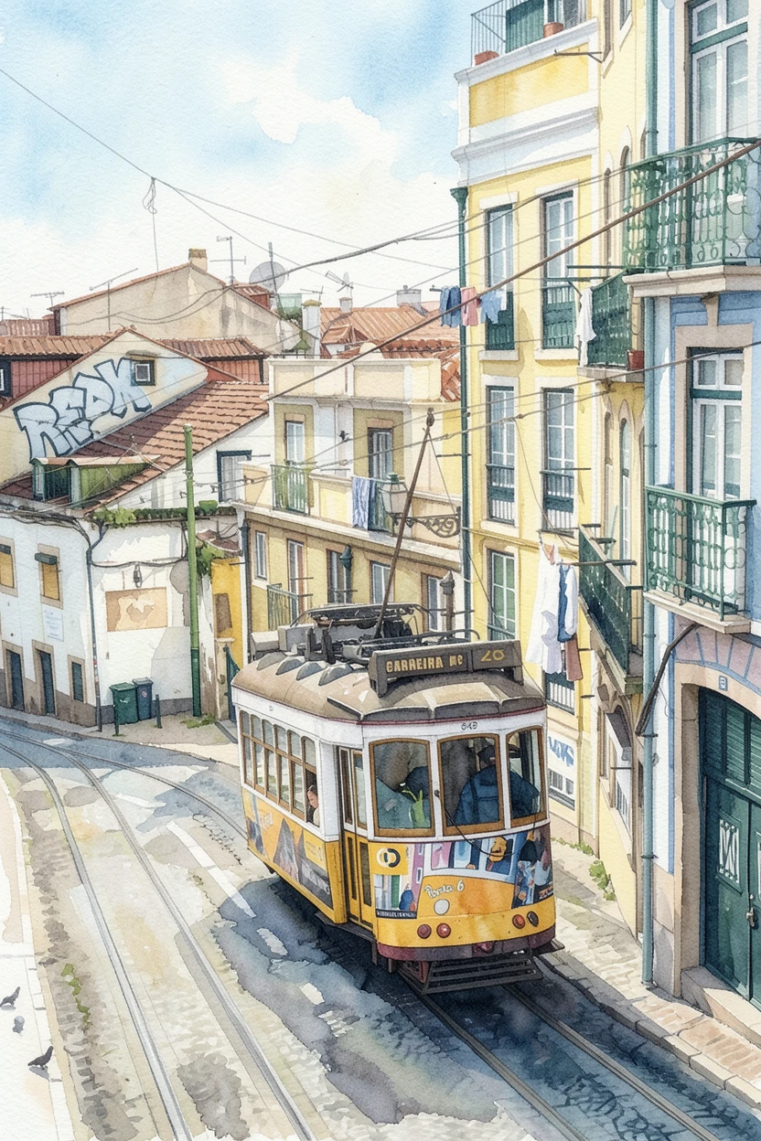 Photo Watercolor
 Source photo by 5116225 via Pixabay. After: generated with ReArt.
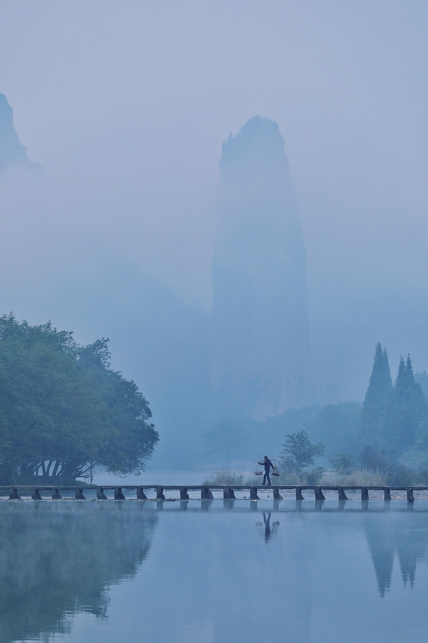
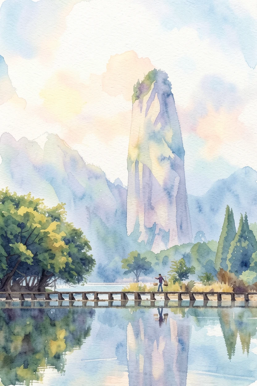 Photo Watercolor
 Source photo by zhangliams via Pixabay. After: generated with ReArt.
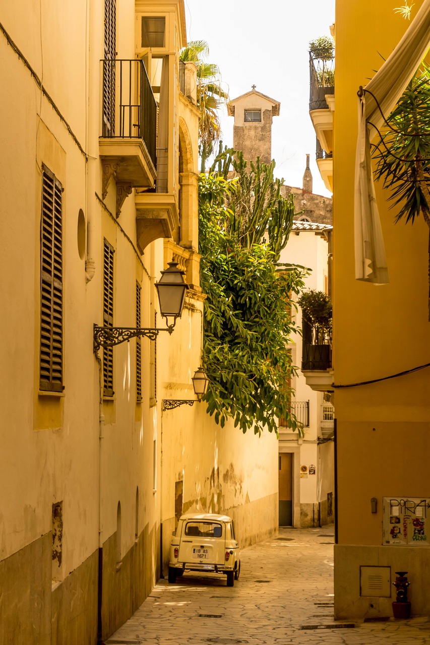
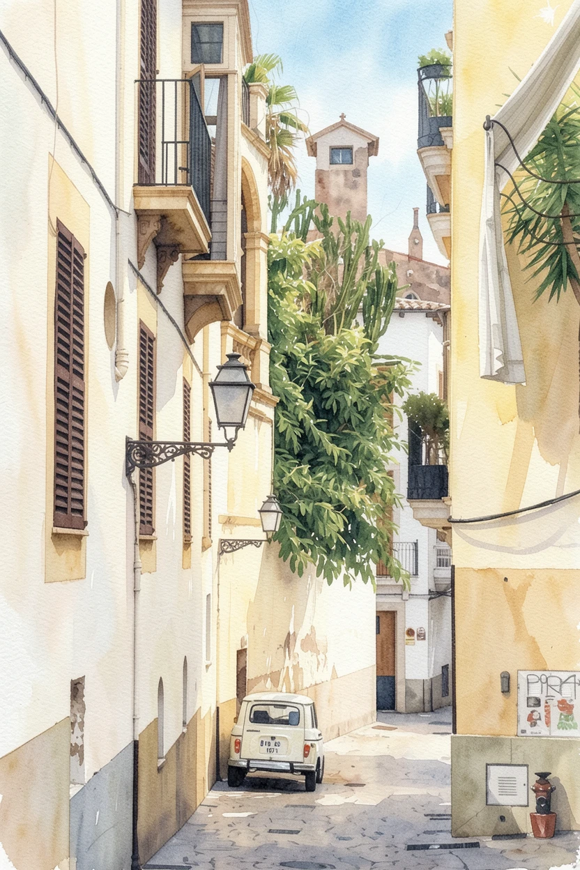 Photo Watercolor
 Source photo by MarciMarc105 via Pixabay. After: generated with ReArt.
Nothing in the subjects matches — a street, a valley, an alley — and the three read as a set anyway, because the hand is the same. That’s the coordination you were dreading having to do by eye, and it’s already done.
Pick the photos, then pick exactly one style
Start with an odd number — three or five. Odd counts settle more easily than even ones; a pair reads as a matched set missing its third, a trio reads as composed. Three is the easiest wall in the house to get right.
Now pick one style and commit to it for all of them. Favor a calm one — a watercolor wash, a soft golden impressionism, an oil rendering. Calm styles forgive variety in the source photos; a loud, high-contrast style fights across three different scenes and drags back the exact clutter you’re avoiding. The style’s whole job is to be the quiet, constant thing the wall has in common, so let it stay quiet.
And here’s the part that’s easy to miss, looking at the three above: it doesn’t matter that they were shot years apart, on different phones, in different light. The rendering re-lights all of them the same way. No stack of raw prints can do that — each one keeps its own original light — and that mismatch is most of why “just print them” never looked right.
Treat the whole cluster as one shape, then size that shape
This is the rule that saves most gallery walls, and it’s the same rule that saves a single canvas — you just apply it to the group. Don’t size each piece. Size the whole cluster as if it were one rectangle.
Measure the furniture below it — the sofa, the sideboard, the console — and multiply its width by about 0.7. That’s the target width of the entire arrangement, edge of the leftmost piece to edge of the rightmost. Undersized art doesn’t read as modest; it reads as a placeholder, and a too-small cluster reads as clutter floating in space. Fill roughly two-thirds of the furniture and the group anchors.
Inside that shape, a few conventions keep it calm rather than chaotic:
- Keep the gaps tight and equal — about 5–8cm between pieces. Consistent spacing is most of what your eye reads as “aligned.” Uneven gaps are most of what it reads as “messy.”
- Work off a shared line. Either a common centerline running horizontally through every piece, or a common baseline the bottoms sit on. Pick one and hold it. A staircase run uses the stair angle as its baseline — step each piece up to follow the climb.
- Mind the hang height. Over furniture, the bottom of the cluster sits about 15–20cm above the sofa back or sideboard, so the art and the furniture read as one group instead of two.
- Match the format. Same orientation, same proportions, same treatment of the edges. This is where consistency does its quietest, heaviest lifting.
- Rehearse on the floor. Lay the whole arrangement on the ground first, gaps and all, and move pieces until it settles. Nobody gets it right on the wall with a hammer already in hand.
Where our size ceiling turns into the right answer
Our largest canvas is 60 × 90cm, and for a single statement piece over a big sofa that ceiling is a real limit — one of those alone can’t cover a full three-seater without reading undersized. For a gallery wall it’s the opposite. A wall this way wants several smaller coordinated pieces, not one giant one. Three 40 × 60cm canvases, hung portrait with 6cm gaps on a shared centerline, span about 132cm — roughly two-thirds of a 200cm sofa: that’s a gallery wall built to the rule, and every piece sits comfortably inside what we print. You’re not compromising down to smaller pieces — smaller coordinated pieces are the thing you actually wanted.
One plain line about how these are made: the artwork is AI-generated from your own photos, then printed as a gallery-wrapped canvas or a poster. No easel, no painter. That’s also why the shared-style trick is effortless — you apply one calm style across every photo, and the coordination happens in the rendering instead of in your hands.
See your own set before you commit to anything
The dread underneath all of this is money: buying several prints, hanging them, and finding out only then that it still looks like a photo dump. So don’t commit blind. Upload three or five photos you love, put them all through one calm style, and look at them together on screen as a set — in about a minute, before anything prints and before anything’s paid for. If they don’t cohere, change the style or swap a photo; you’re out ten minutes, not a wall’s worth of canvas.
So go find the three you keep meaning to print. Not the three that match — the three you love. The style will do the matching.