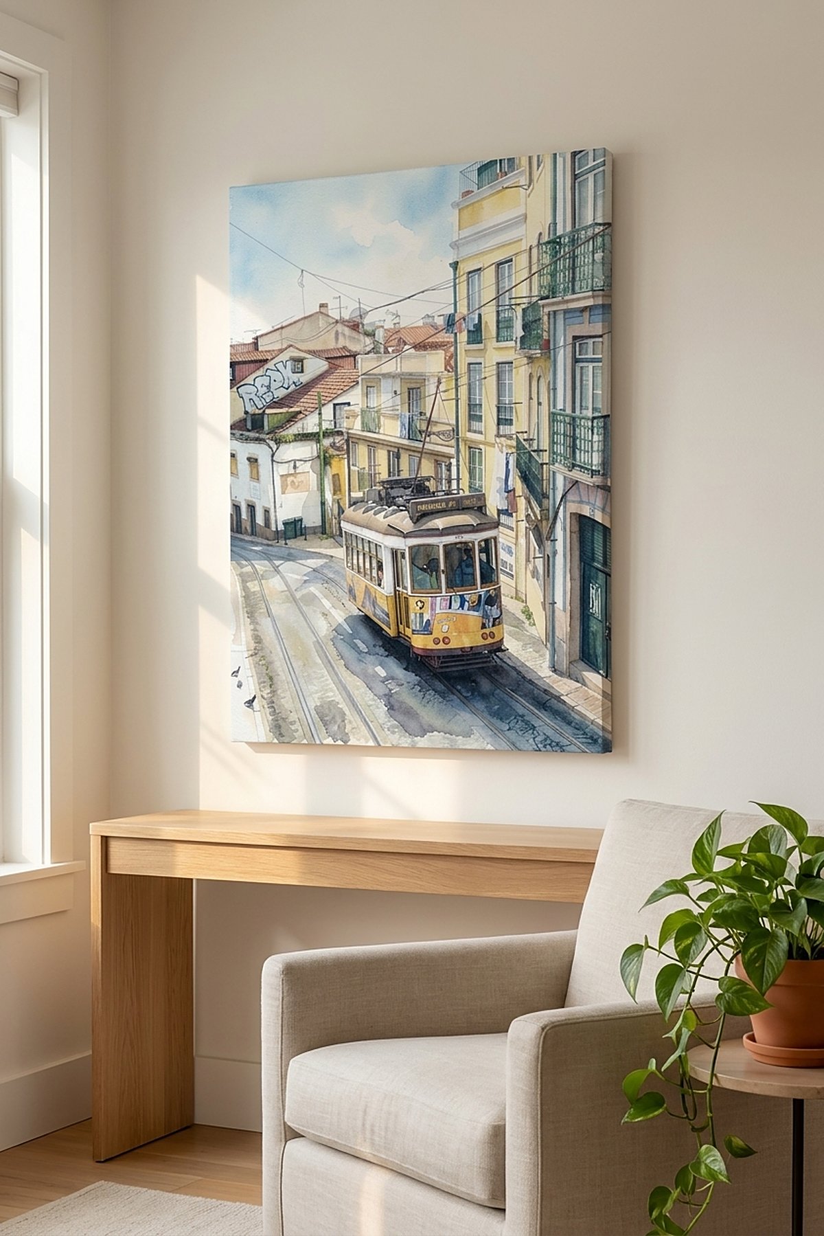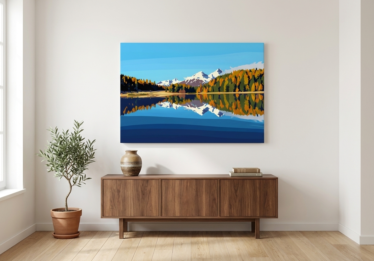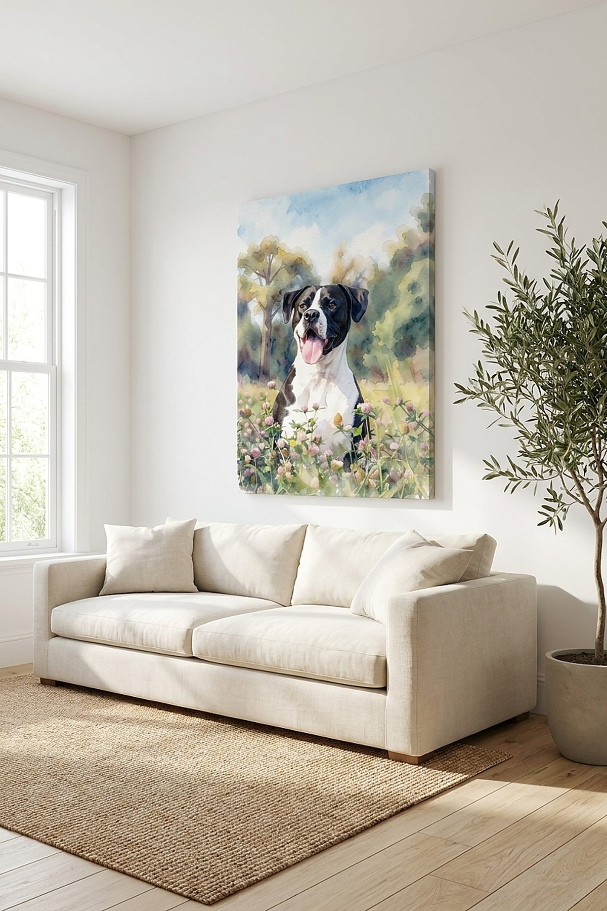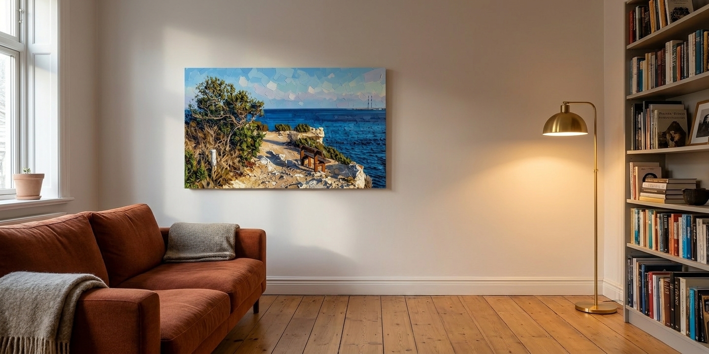
You have one photo open in another tab and one wall you’ve been ignoring since you moved in. The thing stopping you probably isn’t the price — it’s that the style grid you just scrolled showed nine thumbnails of nine different photos, so there was nothing to compare. Watercolor on a beach, oil on a dog, something neon on a skyline. Of course they all look good. They’re all different pictures.
The photo is fixed and the room is fixed. So pick from the room. It’s the one variable you can look at right now, and the one that decides whether the piece still works in March.
Style names below are written exactly as they appear in the picker.
Photo to canvas art: the three questions the room answers
How warm is the room already? Wood, wool, rust or olive upholstery, warm bulbs — warm room. White or grey walls, pale sofa, cool daylight, metal and glass — cool room.
How loud is it already? Patterned rug, full bookshelves, color in the cushions — the room is doing plenty. Plain walls, one or two colors — the room has room.
How far is the doorway? Walk to the door you normally come in by and look back. More than three metres and you’ll be seeing shapes and blocks of color, not detail. Three or less — a small flat, a piece beside a bed — you’ll read it up close, and fine texture is worth paying for.
If two of the three disagree, distance decides. A style that dissolves across the room can’t be rescued by being the right temperature. And warm-but-loud at once — wood, wool, a patterned rug — is the common case, where warmth wins: oil sits into a busy warm room, and the wash just gets lost in the noise. Loudness only decides it in a cool or pale room.
Warm, lived-in room: Oil Painting
If the room has warmth in it and the sofa isn’t pale, Oil Painting is the default, and the safest statement piece here. Thick visible brushwork, deep color. It reads as a painting from the doorway rather than a photo someone did something to, which is usually the worry.
It holds up at distance for the same reason flat color does — brushstrokes are big shapes, and big shapes don’t dissolve across a room. Oil gets there with texture, Vector Poster with edges; the difference between them is warmth, not carrying power.
Where oil is wrong: a very pale, minimal, cool-toned room. It’ll sit on the wall like a heavy piece of furniture nobody asked for.
On the try-hard worry, while we’re here — what stops a piece looking cheap isn’t where it came from, it’s whether it resolves into a few strong shapes from the doorway. That’s a property of the style you picked, which is the one thing this page is about.
Light, small, or cool room: Watercolor Wash
If the walls are white, the light is good, the sofa is pale, or the doorway is close, the default is Watercolor Wash. Pigment bleeding into paper, edges left unresolved, white breathing through. It adds almost no visual weight, which in a small room is the entire point — and the same logic makes it right for a room that’s already loud. A busy room doesn’t need a second loud thing.
Where it’s wrong: a dim north-facing room, or a wall the afternoon sun never reaches. The wash works by leaving white breathing through, and in poor light that white goes grey and the piece recedes into the wall.
Cool or pale room, but the doorway is four metres or more? Don’t take the wash. Take Golden Impressionism — it keeps the light feeling of the wash with enough pigment to hold at distance. If the room is also large and plain, oil in a cooler palette.
That’s the fork you’re stuck on, so here it is on one photo rather than two. Same coastal shot, same crop, both defaults:
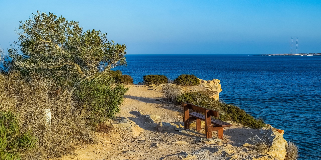
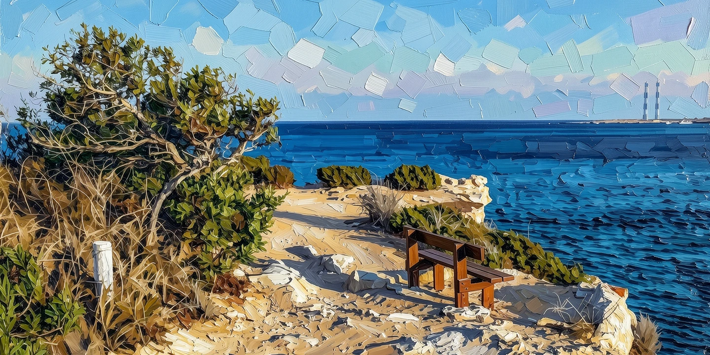 Photo Oil Painting
 Source photo by dimitrisvetsikas1969 via Pixabay. After: generated with ReArt.
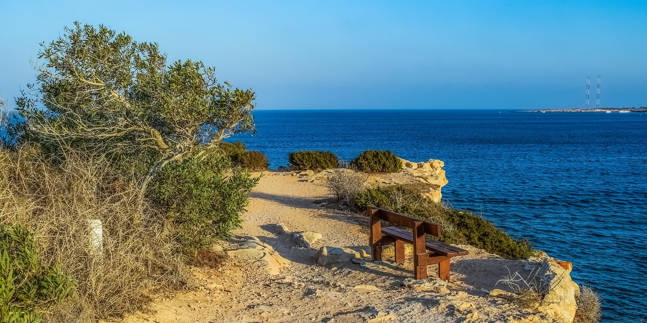
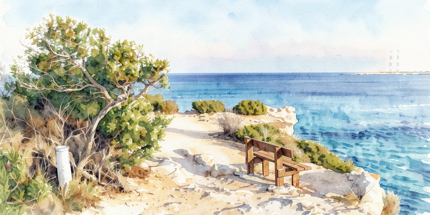 Photo Watercolor Wash
 Source photo by dimitrisvetsikas1969 via Pixabay. After: generated with ReArt.
Two quieter styles: Golden Impressionism and Soft Pastel
Golden Impressionism — for a cool room you want to feel warm. It pushes warm light into the image rather than rendering what was there. Wrong in a room that already gets strong afternoon sun; it doubles up.
Soft Pastel — hand-drawn pastel marks over a flat color backdrop. Softer strokes than oil, but that background is a deliberate block of color, so it’s quiet in texture rather than quiet overall. Good in a bedroom, or a pale room where the wash feels too thin. Wrong on a big wall at distance.
Which styles are loud, and who they’re actually for
Five of the nine are loud on purpose, and loud has a right place. It just usually isn’t above a sofa.
Vector Poster — flat color, hard edges, no texture. Excellent in a plain modern room with white walls, and the loudest thing that still reads as grown-up decor. In a warm cluttered room it fights everything.
Textured Symbolic — bold abstract silhouette, dramatic color contrast, a grainy pastel-on-canvas surface. For a deliberately plain room where you want the wall to be the event. Not a background piece, and the one most likely to tire you by spring if you sit facing it every evening.
Color Pencil — despite the name, this is scribble-marker energy: chaotic overlapping strokes and neon. It belongs where the woodcut belongs, somewhere you walk past. It is not a quiet sketch and it will not behave like one over a sofa.
Retro Pop Woodcut — dense carved linework and a screen-print look. A hallway, kitchen or home office. It works because you walk past it rather than live under it.
Cuddly Plush — turns the subject into a soft toy. A kid’s room, or a gift you both find funny. Jokes on a living room wall get old fastest.
Same coastal photo again, this time in Vector Poster — scroll back up to the wash and compare what each one asks of the wall:
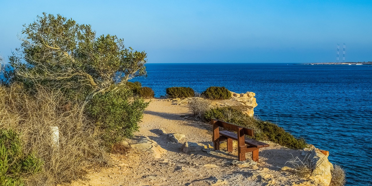
 Photo Vector Poster
 Source photo by dimitrisvetsikas1969 via Pixabay. After: generated with ReArt.
Which photos work on canvas — and which never will
Landscapes forgive. A ridgeline pushed into brushwork just becomes a better shape. Coastal walks and mountain days are the easiest photos to start from.
Faces don’t. Everyone who walks in knows what your partner looks like, so any drift in the features reads as a mistake rather than as style. Faces hold up best in Oil Painting and Golden Impressionism, where visible brushwork explains the softness. They fail worst in Vector Poster, which flattens a face into shapes and loses the person. Even oil takes liberties with skin, so hang any portrait somewhere you pass close to, not on the far wall.
Pets sit in between. You know the dog’s face as well as your partner’s, but nobody else does, so drift reads as style rather than error. Oil handles fur well — it’s already brushwork. Avoid Vector Poster, which turns a specific dog into a generic one.
Busy candids fail in every style. A crowded market stall, a restaurant table with six people, clutter behind and mixed light. There’s no dominant shape, so every style has to guess, and the guesses land as noise. Same for anything shot in a dark room or zoomed in hard on a phone. If that’s your only photo, the fix isn’t a different style. It’s a different photo. If you’re unsure whether the file you have is sharp enough to print large, we broke down what resolution actually matters here.
What size canvas to order for your wall
Measure the furniture below the wall, not the wall, and multiply its width by 0.7 — that’s your target. Then check the crop and the gallery wrap, because the wrap eats the outer edges of the composition and the 0.7 rule says nothing about that.
Two formats: gallery-wrapped canvas, or the same artwork as a matte poster print for a frame you already own.
Before you pay for anything
Worth saying plainly: a model paints this, not a person. Your photo goes in, an AI-generated painting comes out, and that painting is what gets printed. Which is precisely why you shouldn’t have to guess from a grid of other people’s pictures.
Upload the photo and you’ll see it in every style above, rendered from your actual file, on screen. Nothing prints and nothing is charged until you approve one. If oil comes back heavier than you hoped, look at the wash. If both are wrong, you’re out an evening’s browsing rather than a poster tube you never got round to opening.