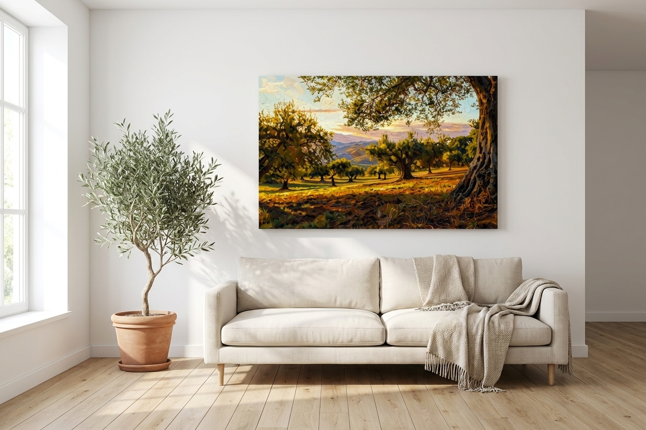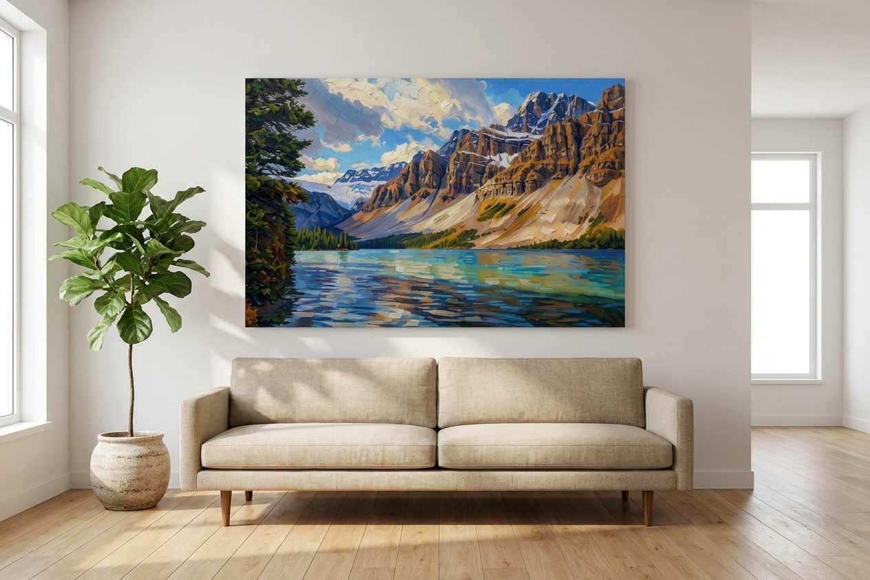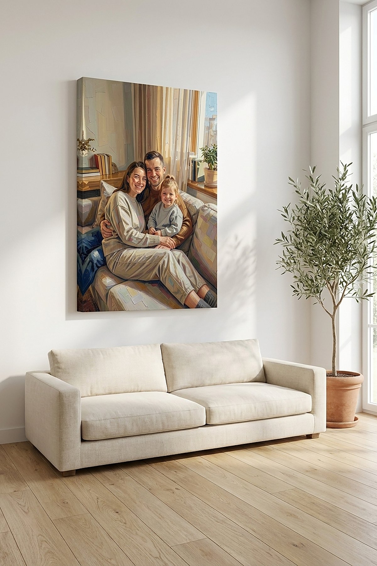
You’ve been saving watercolors to a board for weeks — the loose, light, hand-painted kind, where the colour looks like it’s still a little wet. And you have one photo you’d love to see that way: the bouquet from the wedding, the first photo of the baby, the peonies from the garden, that quiet morning by the water. You typed “watercolor painting from photo” and then hesitated, because you’ve also seen how this can go wrong — a heavy, muddy filter with a texture slapped on top, faces gone slightly waxy, none of the airiness you were actually after.
That hesitation is worth listening to. Watercolor is the least forgiving look to fake, because the whole appeal is lightness, and heavy-handed effects kill lightness first. So here’s the honest version: what a watercolor treatment genuinely does to a photo, which pictures suit it, and how to keep the result soft rather than muddy.
What a watercolor painting actually does to a photo
Oil builds a picture up — opaque, dense, layer over layer. Watercolor works the opposite way. It’s about light passing through thin, translucent washes, colour blooming and bleeding at the edges, and — the part people miss — the white of the paper left bare to do the brightening. Empty space isn’t unfinished in watercolor. It’s the style.
So a proper watercolor treatment isn’t a filter stamped over your pixels. It re-reads the image as washes:
- Translucency instead of density. Colours thin out and let the paper glow underneath, the way real watercolor sits light on the page.
- Soft, bleeding edges rather than hard outlines — shapes suggested rather than spelled out.
- Breathing room. Skies, water, and backgrounds drop back into pale, quiet washes, which is exactly why watercolor suits bright, airy, uncluttered rooms.
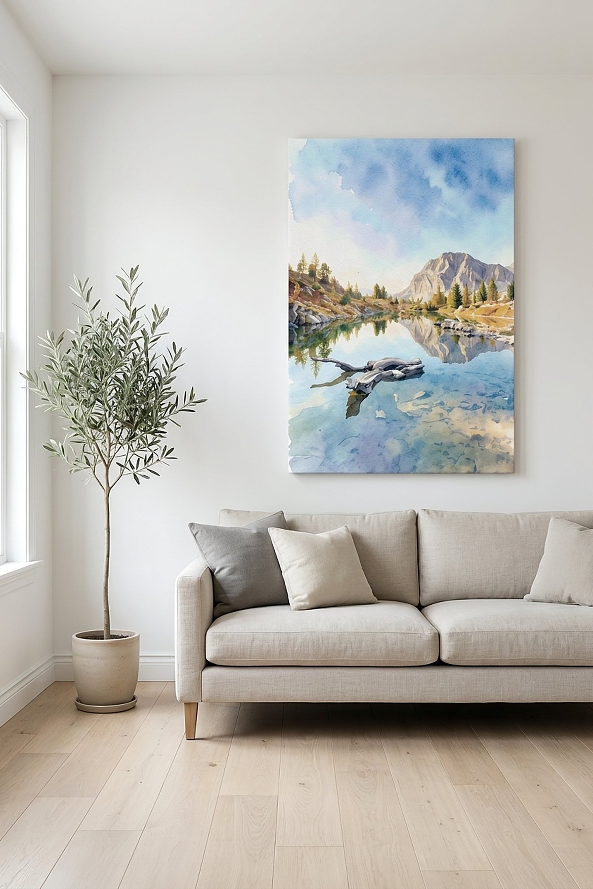
A calm landscape is the easiest place to see it work, because there’s no face to worry about — just light and water becoming paint.
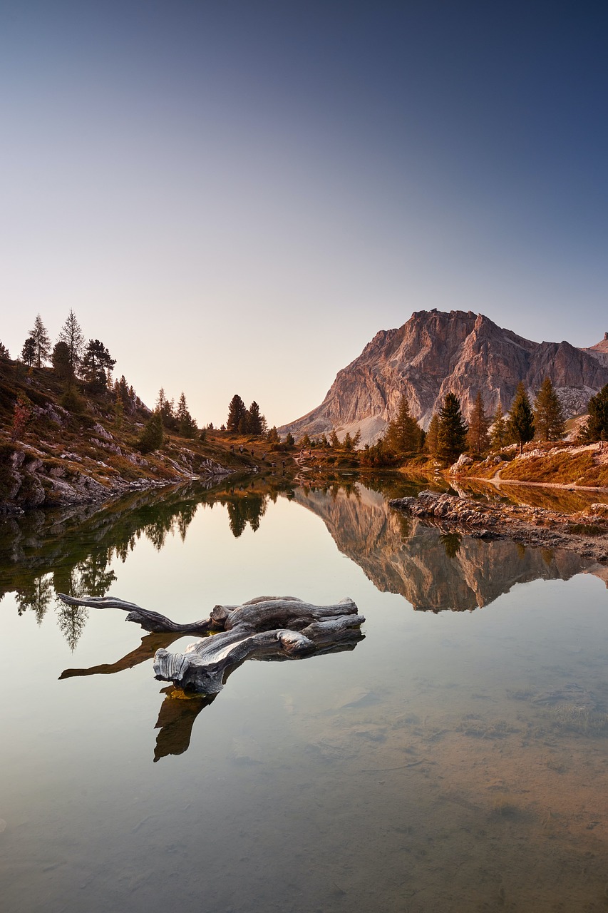
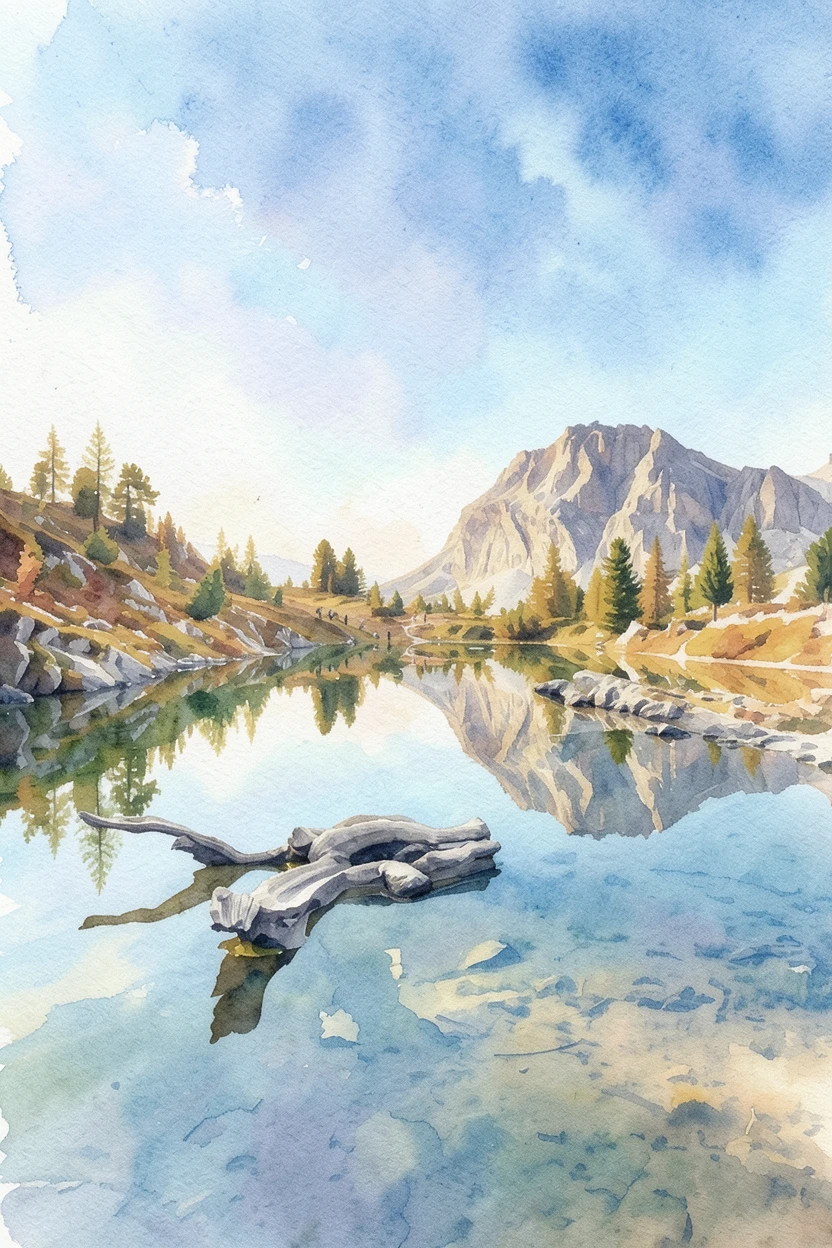 Photo Painting
 Source photo by saraelison01 via Pixabay. After: generated with ReArt.
Which photos suit a watercolor painting
Some subjects were practically made for this medium, and it’s worth choosing one on purpose. Watercolor has always loved:
- Flowers and bouquets — soft petals, pale colour, the odd stray stem. Classic watercolor territory.
- Landscapes, water, and skies — anything where light and atmosphere matter more than fine detail.
- Venues and quiet architecture — a church, a doorway, the place you got married.
- Gentle candid portraits and pets, where you want warmth and softness rather than sharp, literal detail.
If your photo is delicate, light, and simple, watercolor will flatter it. A wedding bouquet is almost the perfect case: pale flowers, a white dress, nothing shouting for attention.
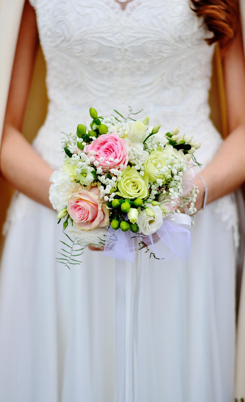
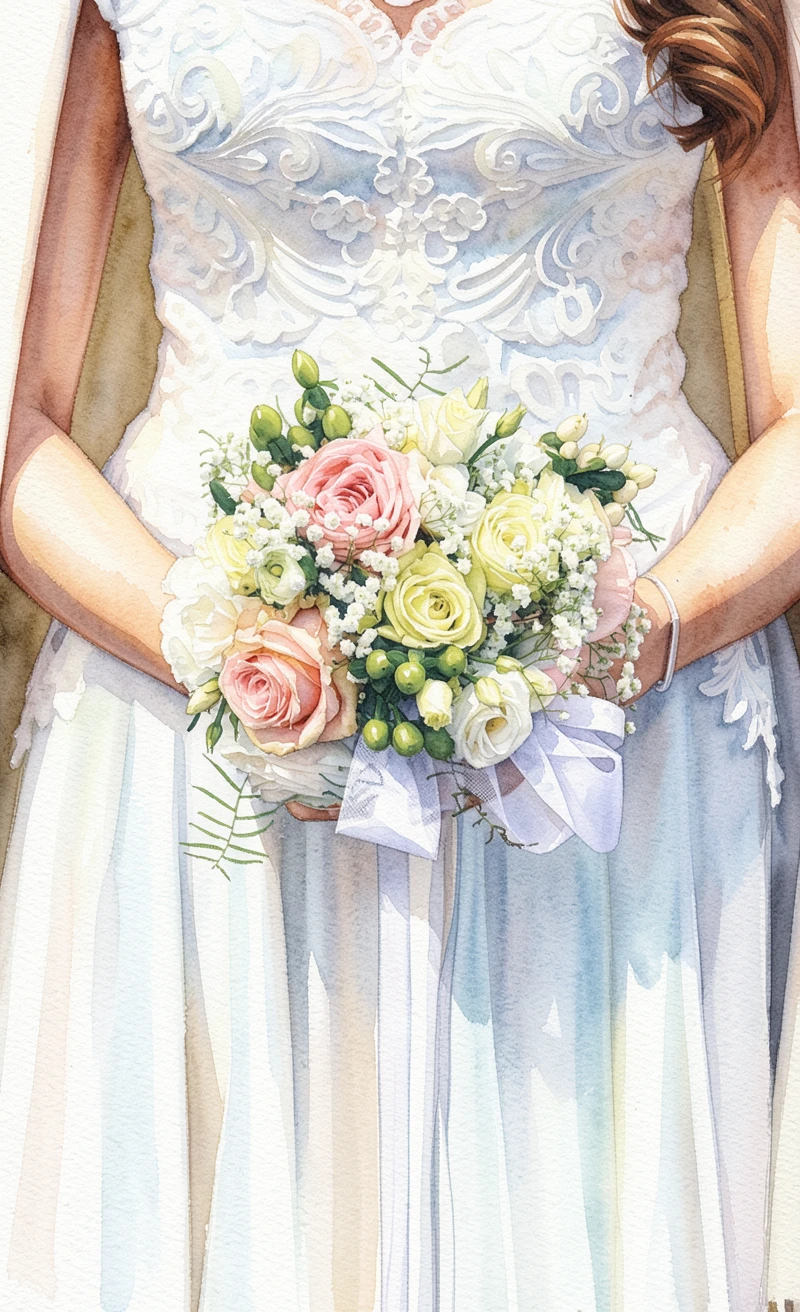 Photo Painting
 Source photo by congerdesign via Pixabay. After: generated with ReArt.
Will it still look like them?
This is the real worry, and it’s fair — especially with a face or a pet you’d know in a heartbeat. Here’s the honest framing: watercolor is meant to be loose, and that softness is a feature, not a fault. It flatters rather than scrutinises, and forgives the small imperfections a sharp, literal style would put under a magnifying glass.
What that means in practice: the things that carry likeness — the shape of a face, the markings on a pet, the specific colouring — still come through when they’re clear and well-lit in your photo. You just get them rendered gently, not forensically. Give it a sharp, evenly lit original and the result stays unmistakably them, only dreamier.
One honest caveat: faces are where watercolor is loosest of all. So if your photo is of a person, judge the likeness on your own face in the free preview before you commit — it’s the one thing worth checking with your own eyes rather than taking our word for.
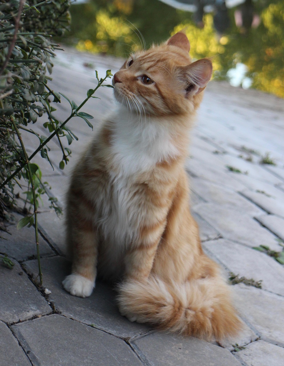
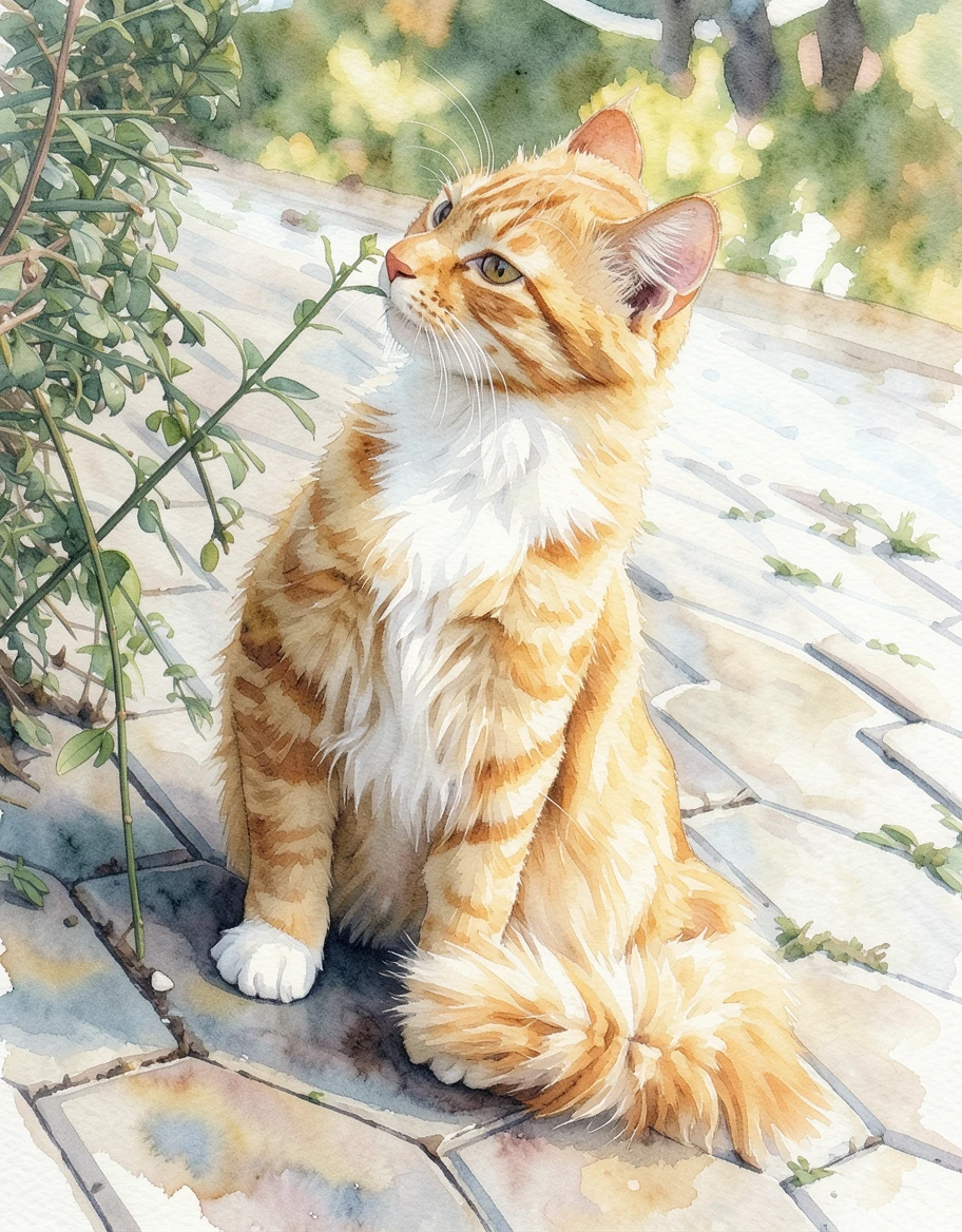 Photo Painting
 Source photo by ParsleyBall via Pixabay. After: generated with ReArt.
Which photos fight the watercolor look
Because lightness is the whole point, the photos that struggle are the ones that crowd it out:
- Busy, cluttered scenes. Watercolor needs open, quiet space. A background full of competing detail leaves nowhere for the washes to settle, and the airy quality disappears.
- Very dark or heavily shadowed shots. Deep, murky shadow is exactly what turns a watercolor muddy. The style wants light to work with.
- Tiny faces in the distance. Loose edges are lovely on the subject that matters and unhelpful on a face that’s already small — crop in to what you care about.
If you’re torn between two photos, pick the brighter, calmer, simpler one. For watercolor, breathing room beats a clever angle almost every time.
Canvas or poster for a watercolor?
We print two ways — canvas and poster — and watercolor is the one look where poster genuinely competes.
Poster suits watercolor beautifully, because paper is the medium’s native surface. A clean paper print keeps the washes light and the white bright, and it reads honestly as a watercolor. It’s also easy to slip into a frame you already own.
Canvas gives the piece physical texture and presence, with no glass and no glare — lovely for a larger statement over a sofa or bed, where you want the painting to feel present in the room.
Neither is wrong. For a soft, delicate watercolor in an airy room, a poster often carries it best; for something bigger and more of a centrepiece, canvas. (If you love the framed look, framing a poster yourself is easy — we print the canvas and poster; the frame is your call.)
The honest next step
A good photo-to-watercolor conversion isn’t a filter and it isn’t a promise of a hand-painted original. It’s a translation into a softer, lighter language — and it’s at its best when you feed it a clear, bright, uncluttered photo of something you love.
The useful part is that you don’t have to guess. Upload your photo, see the watercolor preview against your own image, and check the two things that matter — does it still feel like them, and would it look right on the wall — before you decide anything.
If you’ve got the photo in mind, try it and see what the watercolor look does with it: platform.reart.app